The art of writing
IV. Adornment
Decorative initials, developed decorations of margins, distinguishing graphic capitals, as well as other decorative elements and compositions appearing in manuscripts had a few basic functions.
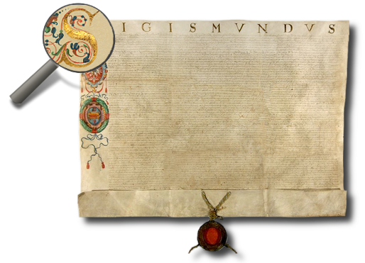
First of all – they represented adornments. The term illumination (understood as the decoration of initials and margins) comes from the Latin verb illuminare, meaning lighting, adornment. The beautiful appearance of a document was not, however, the principal goal in itself. Above all, it accented the rank of the manuscript and the prestige of its publisher (and also often the position of the recipient).
Therefore, while decorating manuscripts, gold was often used to illuminate the text in the form of thin flakes, e.g. for initials, capitals or miniatures.
Decorative elements also fulfilled a function – they helped readers to find orientation in texts. Thanks to the decorative letters, capitals, or whole pages, distinguished from the remaining parts of the text, the reader could more easily find its particular parts (proof of this could be examples of capitals decorated with such style and generosity that... their reading could be hindered).
Planning of the location of decorative elements in manuscripts took place at the beginning of the “design” process.
The scribe, whose task was to write down the principal parts of the document or book, left empty spaces in the places designated for the decorations while writing the text.
He did the same – illustrated by the example placed beside – with reference to the planned initial, which for unknown reasons was never finished. However, thanks to this example, among others, we know how work on the composition of a manuscript was organized.
designated for an initial.
A large role in the decoration of manuscripts was played by specialized illuminators (see A scribe), however, the work of the scribe was also significant.
The style of writing itself and the way of writing down text by the writer – with due care and according to the principles of calligraphy, led to order and harmony in the whole manuscript. After all, in the case of produced books e.g. related to the activity of courts or town rulers, created due to the activity of such organs, on a larger scale, the role of the illuminator was filled by writers, carrying out decorations with quills.
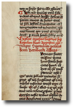
The simplest form of adornment in manuscripts was to distinguish particular letters, expressions or fragments of texts. This was carried out, for example, by writing parts of text with a different colour ink than in the remaining parts.
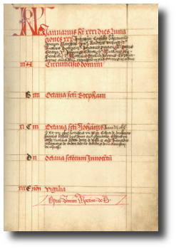
The most popular was to use red paint, in other words, rubrication (the Latin word rubrica means red paint). That's how rubrics were created, in other words, fragments of text written in red.
They were used mainly for headings, fulfilling, thanks to their colourful distinction, the function of tagging a selected place in the text.
To ease orientation in the text, there were other distinguishing elements placed in manuscripts – different from the main text due to their shape or size, among others.
These were initials, decorative capitals, decorations in margins and miniatures.
These elements were, on the whole, much larger than the main text of a document, and distinguished specific places in the manuscript by drawing the attention of the reader. They simultaneously fulfilled a decorative function and, depending on the size and wealth of the ornaments, they emphasized the importance of the manuscript.
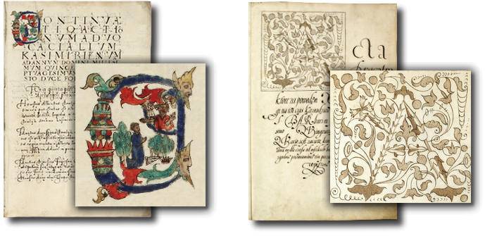
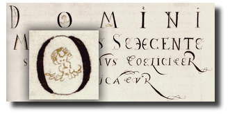
An initial, in other words, a letter beginning a paragraph of text, was written in a defined field, whose shape and size varied. They could be included e.g. in an oval form, or a rectangular one. The initial was most frequently written in a significantly larger size than the text (sometimes it even took up a large part of the page). It also often differed from the rest of the text in colour.
In the area of the initial, various types of decorations were painted – human forms, or genre scenes (the so-called figurated initial) or it was filled with plant and animal motifs or geometrical patterns (the so-called ornamental initial).
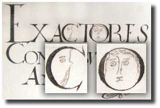
Not only were single initials decorated, but also whole words, headings, and even paragraphs of text.
Decorative writing was used for this, and was larger than the other letters, and often also different from the rest in its style.
Besides this, such headings were often decorated with additional elements – depending on the skill and inventiveness of the creator – from simple drawings to complicated beautiful ornaments.
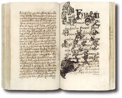
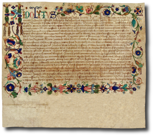
Decorative elements were also placed in the margins of manuscripts. These were often paintings of colourful, dynamic graphic compositions. The subjects of these decorations varied. Generally, they were plants, flagella and garlands consisting of leaves, stems, fruits and flowers. We define this type of decoration with the name foliage. Foliage was also sometimes additionally enriched with drawings of birds and animals.
A complement to foliage were also the, popular especially in the middle ages, so-called drolleries (from the French word drĂ´lerie, meaning comical scenes). These were fantasy motifs, presenting people and animals (often imaginary ones), in comical, unreal or grotesque forms, or whole scenes maintained in the same convention, both from life and from the world of fairy tales.
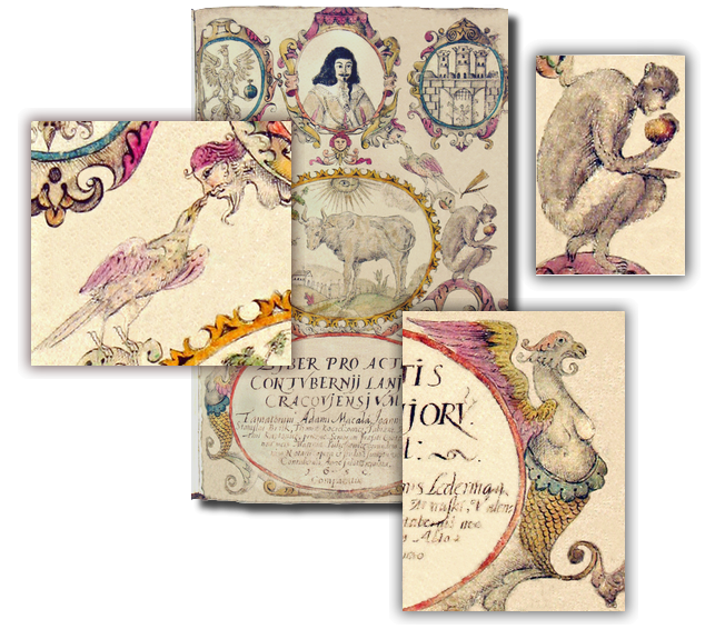
It is also possible to find borders in preserved manuscripts. This is a form of margin decoration, made on all the margins of the page – just like a kind of frame. It could contain figurated decorations and ornaments, which may repeat (e.g. symmetrical, on opposite margins).
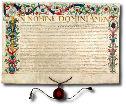
Decorative elements sometimes played the role of graphic commentary to the contents of the manuscript. One example here is heraldic motifs, drawings of weapons and arms (the so-called panoply), or elements appearing “on occasions”.
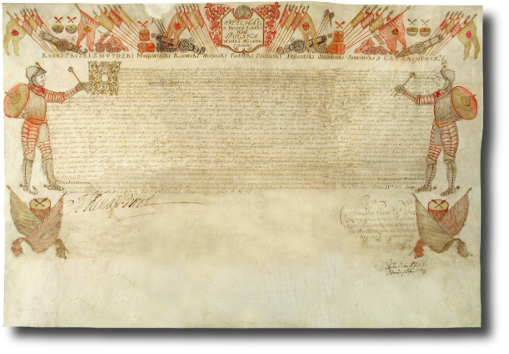
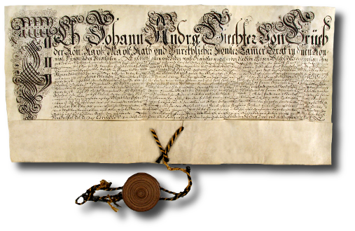
decorating the property acquisition deed for Grzegorz Kazimierz Podbereski,
subject to obligatory military service by him and his male offspring.
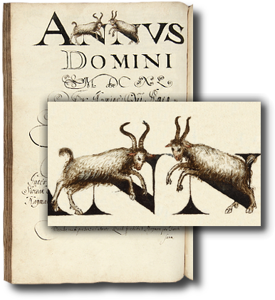
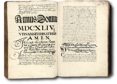
painted in the heading beginning the entries for the year 1640.
A symbolic presentation of saying farewell to the old and welcoming the new year?
The title pages of books and volumes were decorated. Besides the title of the manuscript itself, which was generally written in decorative writing, plant and animal motifs were placed on the title pages, as were symbols and coats of arms, drawings relating to the contents of the books or ones that were totally unrelated. All depending on the inventiveness and fantasy of the creators.
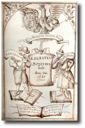
of the town of Krakow placed on the title page of the Record
of Income and Expenses of the Town of Krakow from 1668.
Â
Relatively often, especially in manuscripts with a more usable character (for example, in town records), drawings and decorations testifying to the sense of humour of the writer could be found.
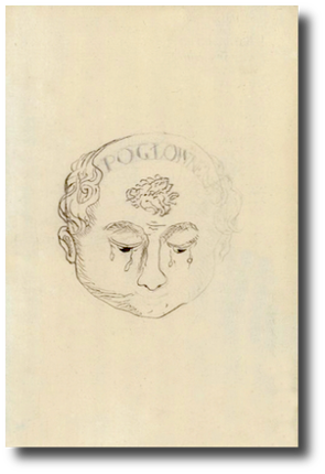
This tax was known as 'poll tax' and was collected from each resident of the town (“from each head”),
regardless of wealth or income. The writer showed a large dose of empathy towards the tax-payers
oppressed by the tax collectors, drawing in the book a crying head with the description “Poll tax” on the forehead.
Â